Client: Diocesan School for Girls
Partners: Scratch, Chemistry, Hunch
My Roles: UX/UI Designer, Animation & Interaction, Frontend Development (Animation), QA/Testing
Website: Visit the project
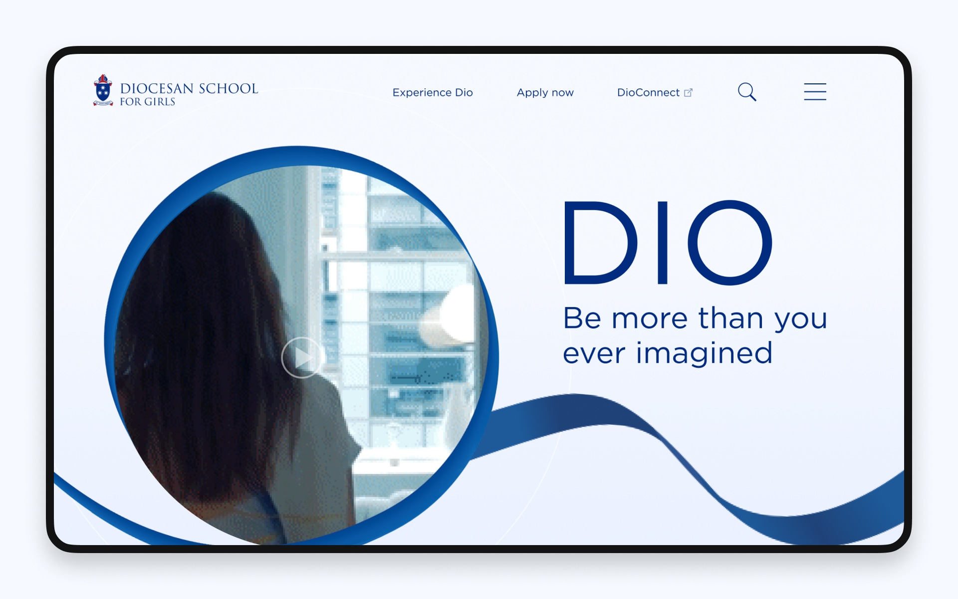
This project revitalised the Diocesan School for Girls’ online presence by transforming a dated website into a vibrant, user-centric digital platform.
By blending fluid animations, custom iconography, and a modern, intuitive interface, we enhanced usability and streamlined content management while honouring the school’s rich heritage.
The problem
Context & contribution
Diocesan School for Girls is a leading independent Anglican school in New Zealand, renowned for its commitment to excellence and nurturing environment for girls from pre-school to year 13.
In a collaborative effort with Chemistry and the school’s brand agency, I served as Digital Producer and UX/UI Designer. My responsibilities spanned design, digital production, animation, interactive prototyping, and frontend development—ensuring the refreshed school manifesto was translated into a cohesive, engaging website.
The challenge
The previous website failed to capture the school’s legacy and modern aspirations. It was widely described as “dark” and “harsh,” and its cumbersome navigation frustrated parents, staff, and students.
Our goal
To create a fresh digital presence that:
- Reflected the school’s rich history with a modern, welcoming aesthetic.
- Enhanced usability through clear navigation and interactive storytelling.
- Streamlined processes such as student enrolment and content management.
Process
- Research & discovery: Gathered stakeholder and user insights to identify pain points and opportunities.
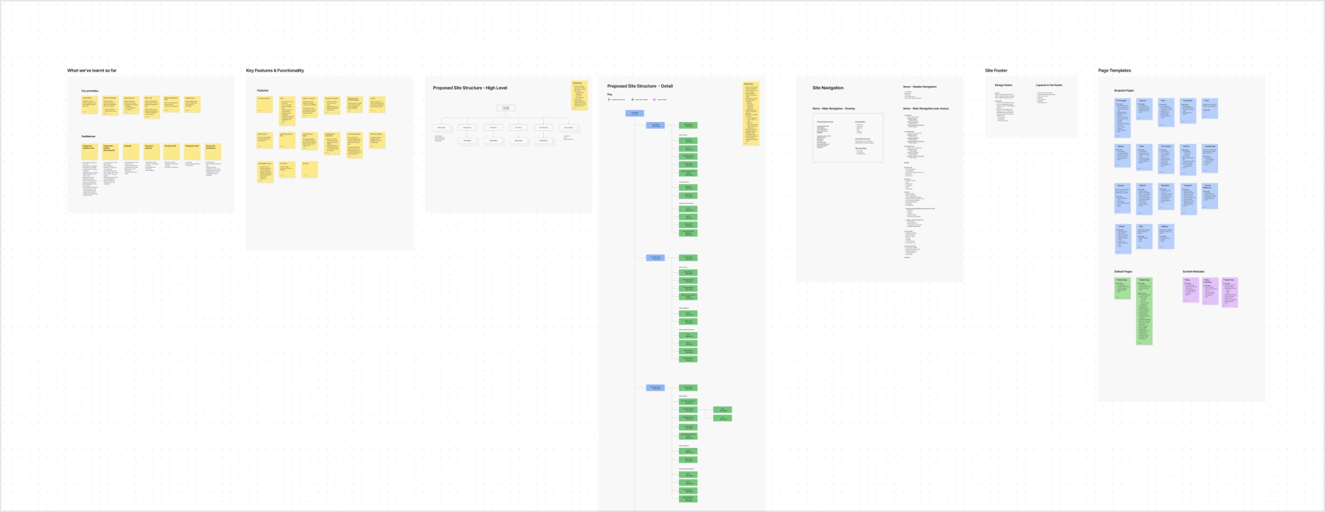
- Ideation & iterations: Developed concepts, created interactive prototypes, and refined design elements through successive iterations.
- Interactive prototyping & stakeholder alignment: Developed a fully interactive prototype to pages and interactions, aligning our cross-agency team and establishing a single source of creative truth for the project.
- Design solutions: Delivered visual identity and website design.
- Supported delivery: Supported the build with frontend development, delivery support and quality assurance.
1. Research & discovery
Approach
We conducted extensive user research—including interviews, surveys, and usability tests—with parents, staff, and students to understand their frustrations and expectations.
Key findings
- Emotional disconnect: Users felt the old website’s look and feel did not represent the school’s nurturing ethos.
- Navigation challenges: The site’s information architecture was confusing, hindering access to key information.
- Demand for engagement: Stakeholders desired an experience that not only informed but also delighted—using animation and visual storytelling to bring the school’s history and values to life.
2. Ideation and iterations
Visual mood boards and interactive prototypes played a crucial role in establishing trust with the client, allowing us to align on key decisions as we worked through successive iterations.
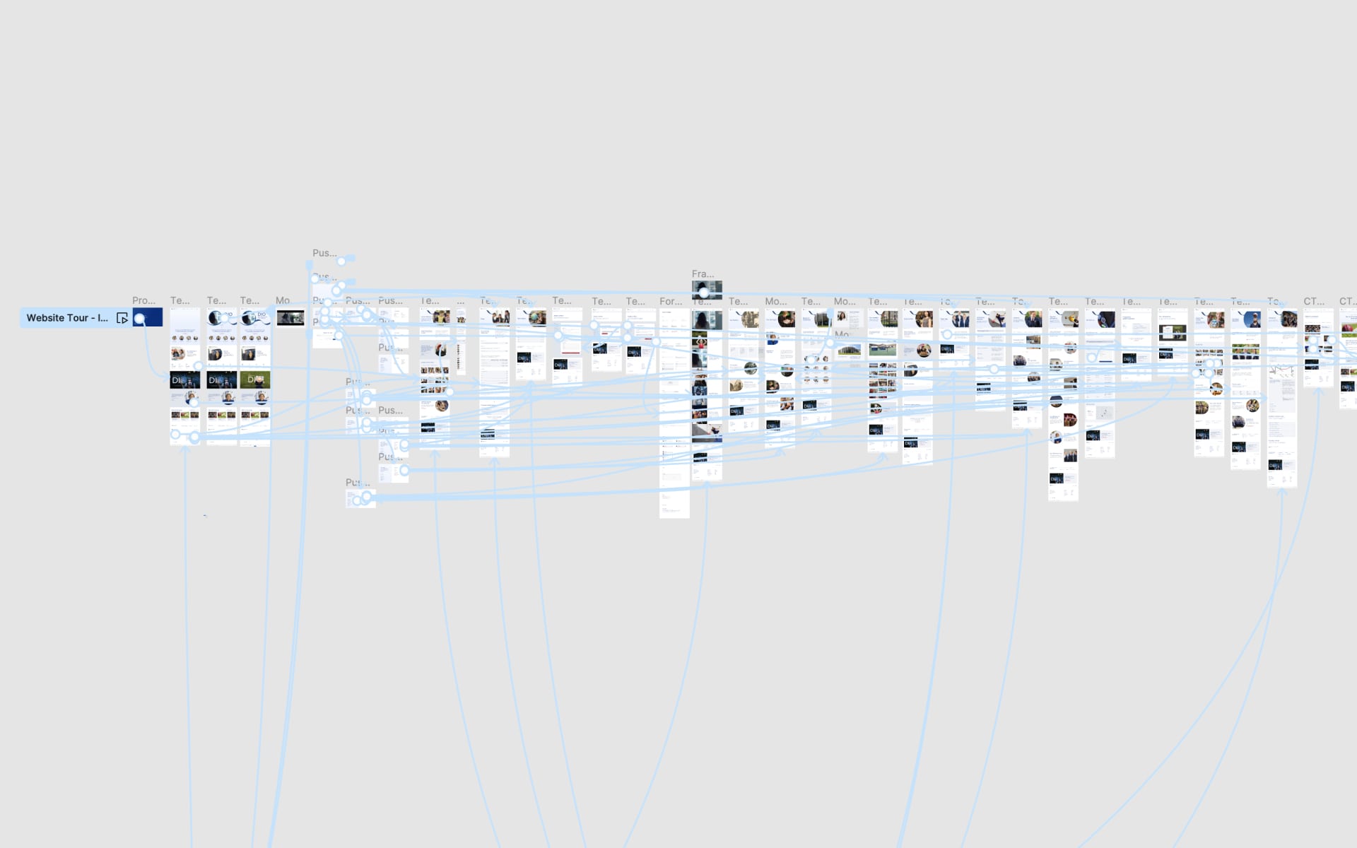
During lo-fi explorations, I created a fully interactive prototype of the website that captured all key pages, components, states and their interactions.
The extra time spent on the prototype created a single source of truth for creative decisions and resulted in much better alignment between the client and partner agencies.
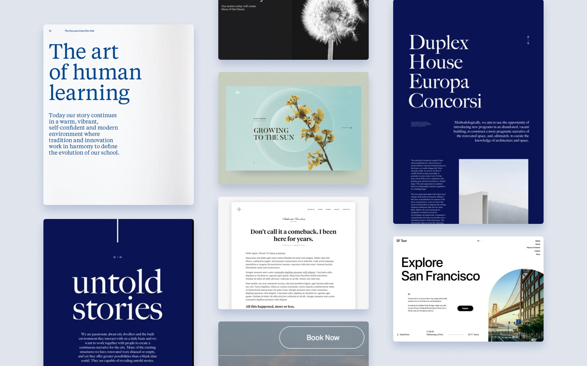
3. Design solutions
Based on research and stakeholder feedback over successive iterations, I completed comprehensive website design and fully interactive prototype which included:
- Fluid animation & thoughtful interaction
- Custom iconography, visual Identity and a pattern library for future use
- Enhanced user journeys & components including a redesigned enrolment form, reusable page templates and updated navigation/information architecture.
Fluid animation & thoughtful interaction
Animations were not decorative—they were integral to conveying the school’s history and fresh manifesto, creating a dynamic, engaging experience.
Bespoke icons
I designed a custom set of icons inspired by elements of school life, reinforcing the brand’s visual language and guiding users intuitively through the site.

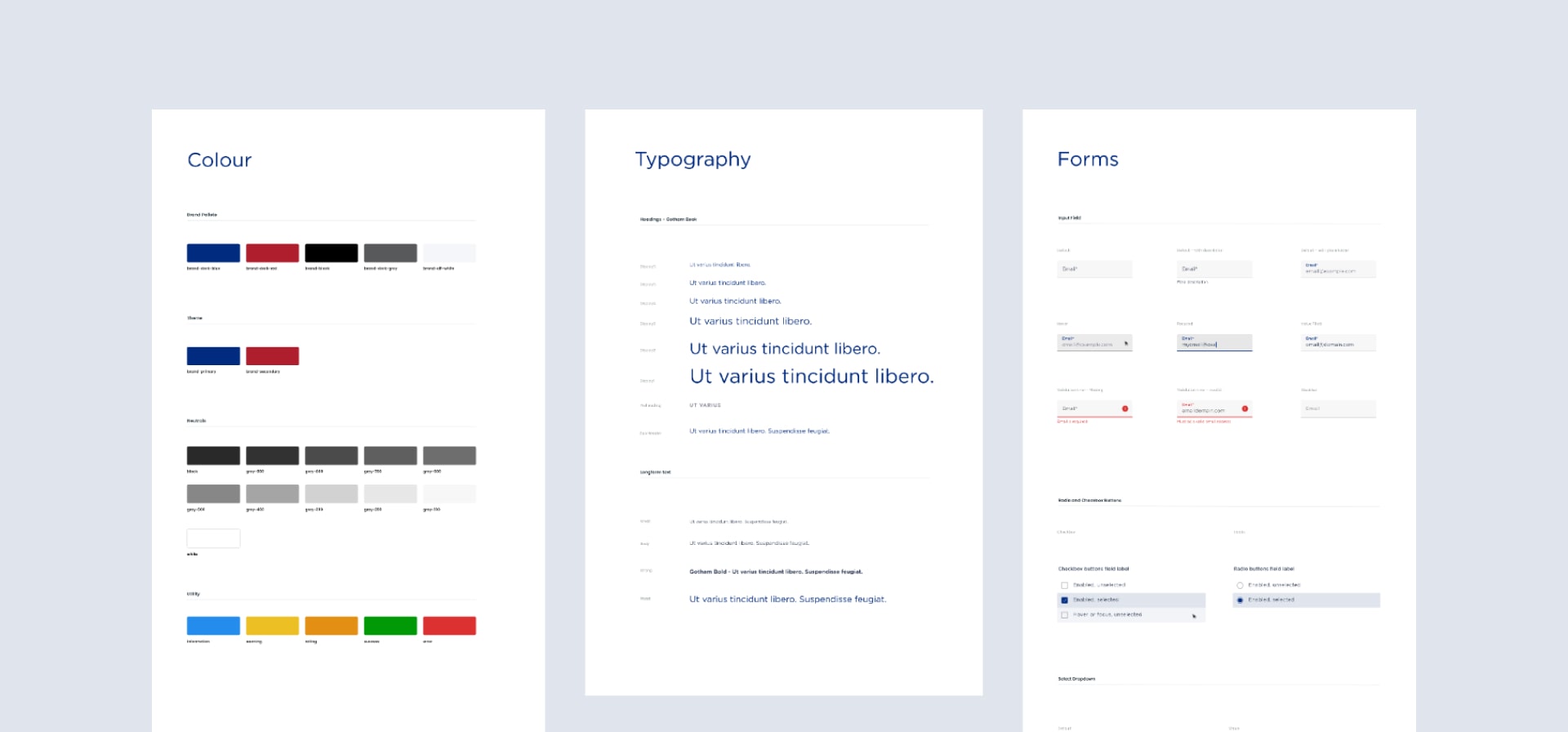
Refreshed palette, typography and pattern library
Drawing inspiration from the school uniform, the new look lightens the overall feel, creating a welcoming digital environment.
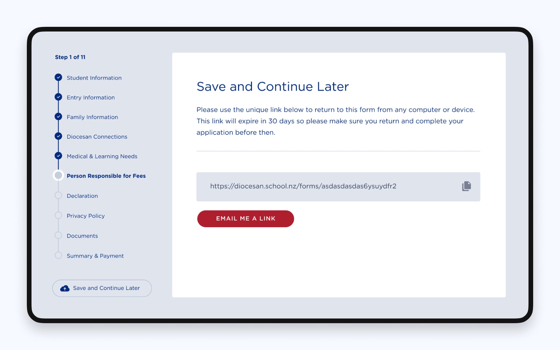
Improved enrolment form
The student enrolment process was streamlined with a redesigned form featuring a progress indicator and a “save for later” function, easing the process for parents.
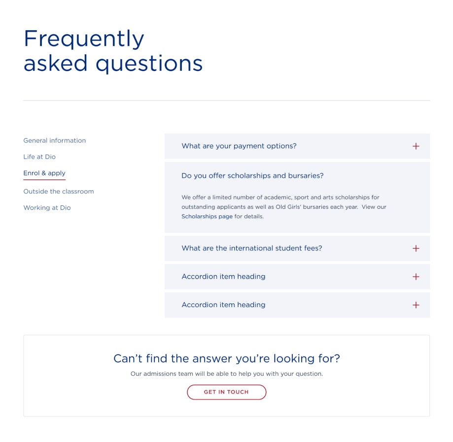
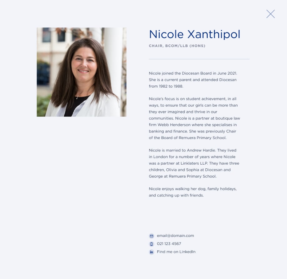
Reusable components
We developed a combination of flexible templates and bespoke components (e.g., FAQ, team profiles) that allow school staff to easily manage and update content via the CMS.
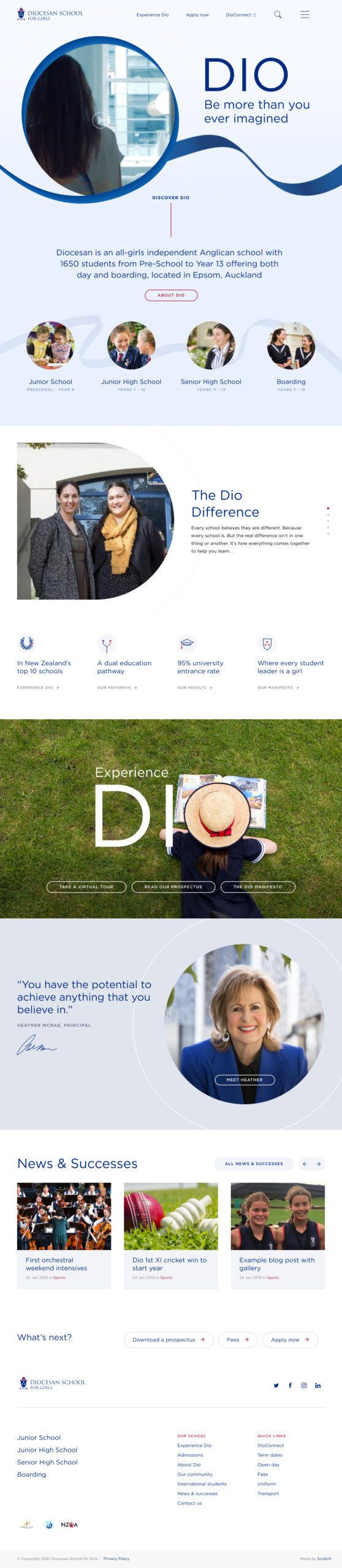
Updated navigation & IA
An overhauled information architecture was created based on research insights, ensuring logical navigation and accommodating future growth.
Impact
Usability improvements
- The new design provides a clear, engaging, and intuitive experience that resonates with all user groups.
- Improvements in the enrolment form and content management have reduced administrative burdens and manual data entry.
Business impact
- A future-Ready platform: The flexible design system and updated IA set the stage for ongoing enhancements, ensuring the website can evolve with the school’s needs.
Reflection & next steps
Key learnings
- Collaborative cross-agency efforts and iterative prototyping were critical to aligning creative vision and technical execution.
- User research highlighted the importance of balancing heritage with modern design, a challenge that was successfully met through thoughtful interaction design.
Future improvements
- Conduct additional user testing and quantitative research to further refine interactive elements.
- Explore personalisation features to enhance user engagement.
- Continuously update templates based on evolving content needs.
The new digital presence for Diocesan School for Girls successfully blends tradition with a fresh new look.
By focusing on user insights, visual storytelling, and a unified visual language, the project has transformed the school’s website into a welcoming, efficient, and future-ready platform that truly reflects its legacy and vision.